From an Idea to a Story
This story was inspired by our family moving from Australia to Texas when Harvey was just four months old.
Preparing to leave familiar places and travel to the other side of the world with a young child made us reflect on how big some changes can feel for families.
We spent three years in Texas, travelling to many places that we would not normally visit from Australia,
but the long flight from Houston to Perth was something we were too nervous to do with a young family. Our second child, Mina, was also born in Texas during this time.
These events helped shape the gentle tone of the book: that no matter how far away you may be, your family and friends will always be there for you.
Main Characters
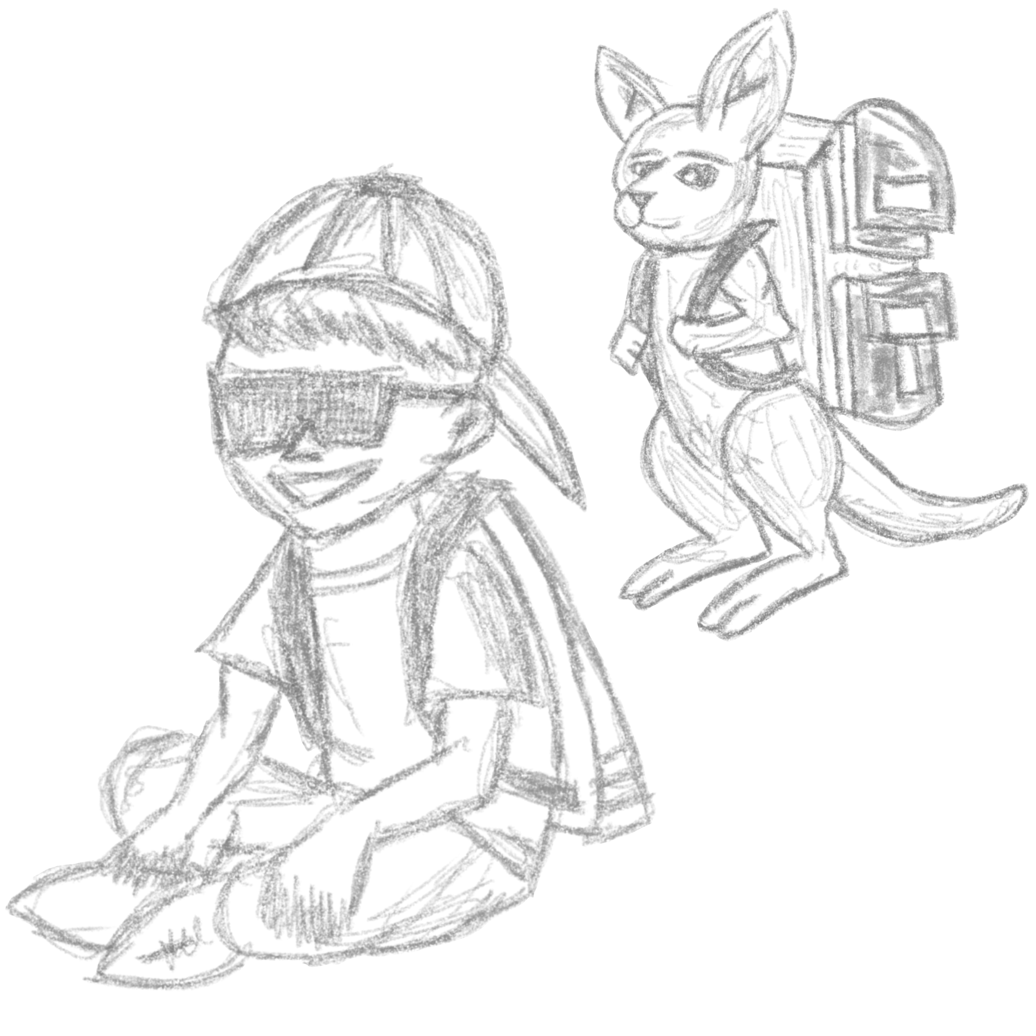
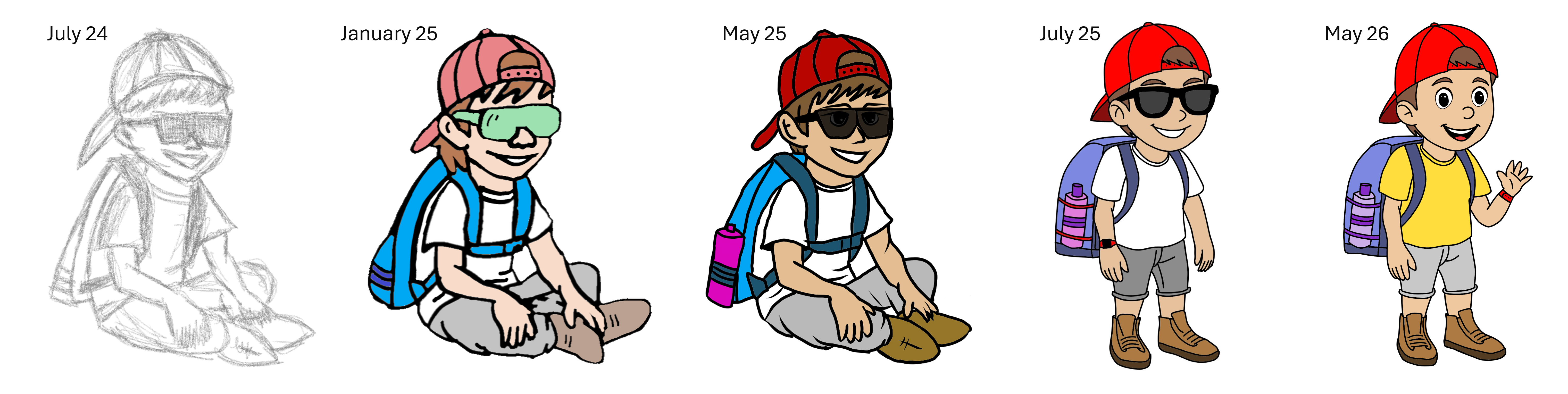
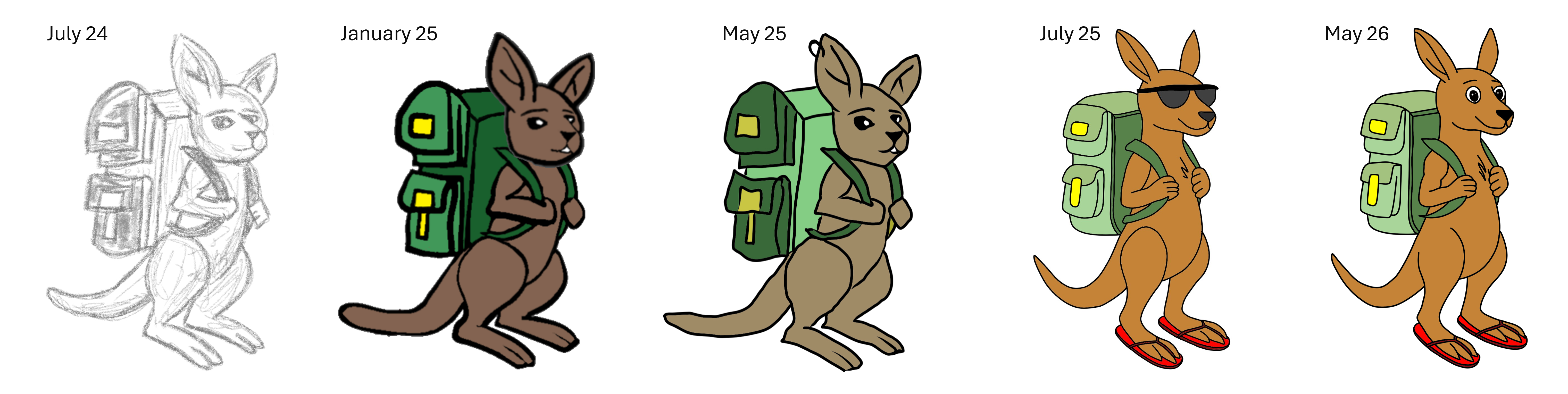
The illustrations started as relatively simple sketches that captured some of my ideas, such as a red cap, sunglasses and backpack.
These slowly evolved into more refined sketches, with colours adjusted to match the backgrounds.
As the ideas progressed, more professional digital drawing software was used to begin finalising the illustrations. Minor adjustments continued,
such as removing sunglasses and continuously assessing the colour palette as the backgrounds changed.
As this was my first time writing and illustrating a book, I made many mistakes and learnt a lot that will help make the process more efficient next time.
Backgrounds and Colour Scheme
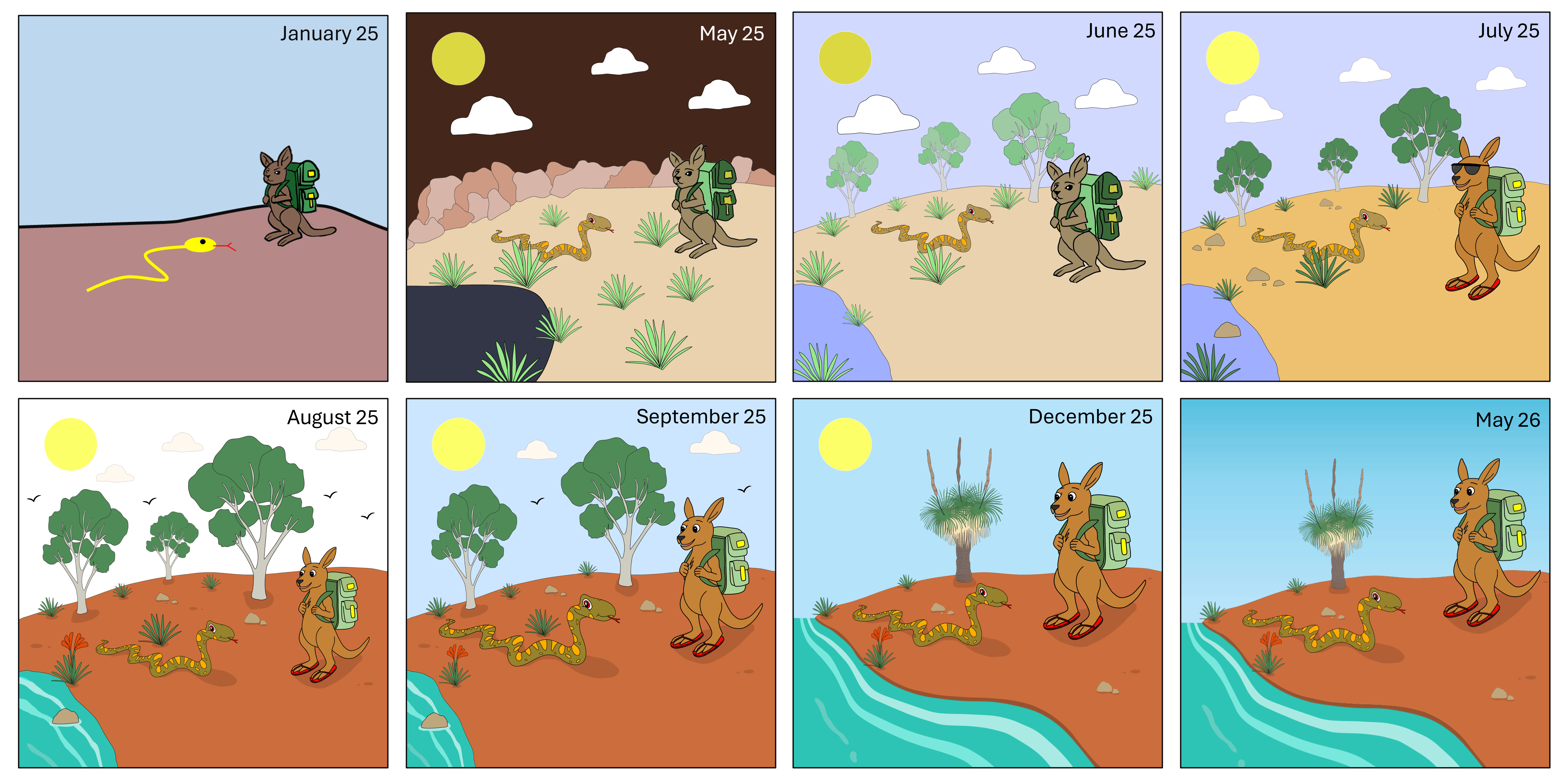
The initial book ideas were quickly sketched out in basic software for the sole purpose of capturing ideas.
In the first example, there is a yellow squiggly line with a head that represents a snake.
This idea progressed into the more detailed drawing now seen in the book. The colour scheme also changed over time.
There were early ideas around being more abstract and including more white space, before finally deciding on a semi-realistic colour scheme with more minimalistic backgrounds.
Final Book and Layout
The final version represents a two-year journey from when the idea was first conceived.
What followed was a long process of identifying suitable scenes and animals, aligning the story,
creating consistent illustrations, and determining the best approach for publication.
Every aspect of the book was scrutinised, from the front cover font, to the text colour,
and the best onomatopoeias to use within the story. It was a terrific learning experience,
and one that I would recommend to others looking to explore new hobbies and skills.